Correction about Magenta
Magenta has a much more interesting etymology than I had previously written.


In the newsletter I sent out on April 3, “The Myth and Reality of Trending Colors”, during a critique of the Pantone Institute’s 2023 Color of the Year, Viva Magenta, I wrote:
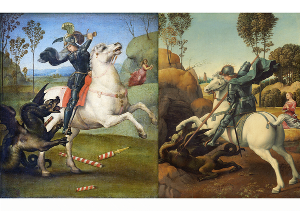
Magenta was named after the 1859 Battle of Magenta of the Second Italian War of Independence, so "exuding rebellion" is a good thing.
A French chemist had synthesized the dye in the same year, originally calling it “fuchsine”, as its hue is similar to that of the fuchsia flower, which was named by a French botanist after a 16th century German botanist, Leonhart Fuchs. To celebrate the French and Italian victory against the Austrians, he changed new hue to "magenta" .
It turns out that the story is so much more fascinating that I had previously known, and I apologize to all the subscribers and readers of Colorphilia for my shoddy research. In no way does this change the general point that Viva Magenta should have not been selected as the name of the color which conveyed the stated inspiration of the Pantone Institute.
To remind you:
"As virtual worlds become a more prominent part of our daily lives, we look to draw inspiration from nature and what is real," said Leatrice Eiseman, executive director of the Pantone Color Institute.
In this age of technology, we look to draw inspiration from nature and what is real. PANTONE 18-1750 Viva Magenta descends from the red family, and is inspired by the red of cochineal, one of the most precious dyes belonging to the natural dye family as well as one of the strongest and brightest the world has known.
In fact, the new knowledge strengthens my original argument to the point that magenta is not color connected to the “primordial” nor “nature”, rather human innovation and experimentation.
Backstory
I’m visiting New York this week to spend part of Passover with my family. On Monday, I spent a number of hours in the reading room of the New York Public Library’s Art & Architecture Collection, taking the opportunity to do some research on Michel-Eugène Chevreul, the French chemist responsible both for the creation of margarine, as well as much of modern color theory.
Chevreul
According to Faber Birren, who wrote the introduction and notes on an English translation of Chevreul’s The Principles of Harmony and Contrast of Colors and Their Applications to the Arts, Chevreul’s theories were the root of much of the Impressionism movement, and specifically Pointillism.
A few misordered excerpts:
"After all, Chevreul was writing for the world of practical men rather than for scientists. He had come upon mysteries which fascinated him, and he wanted to comprehend these mysteries and put them into intelligible order.”
“Chevreul, of course, was an academic theorist, a scientist devoted to the mysteries of optical effects, not a painter. What he explained was of tremendous importance because it opened up new avenues of expression for color. A painter did not have to follow Chevrel's advice literally — he merely had to grasp the significance of the Law, experiment a bit with it, and then strike out for himself into the new fertile territory.”
“At one time in his career, Pissarro became a Pointillist, conforming strictly to what Chevreul termed mixed contrast. Van Gogh also went through a similar phase.”
“Pissarro was fairly articulate on the subject in his correspondence. …[Though, it] is apparent today that some of the Impressionists were reluctant to praise anyone outside their circle. Some were extreme egoists who refused to acknowledge any outside influences.”
One thing that was made very clear in Chevreul’s work was that he dealt in a pure theory of color, with abstract primary colors like “blue”, “red”, and “yellow”, but with theories working with on shades across each color. These overarching colors were in fact more abstract groupings of colors, and a scarlet would have a similar relationship with other colors as a crimson, for example.
The Impressionists
Modern printers use a four color base system, CMYK (cyan-magenta-yellow-key (black)). It falls within Chevreul’s theories, because each of the first falls within the range of the colors of his wheel.
I was so taken by Chevreul’s influence on the Impressionists, I wanted to research the basic color palettes of different Impressionist painters. I was working under the assumption that artists would have a limited palette they would start with, and then mix those colors to create whatever colors they wanted.
So today, I returned to the library with that intent. I ordered a number of books before arriving, and browsed a bit in the shelves for a bit more inspiration. As I walked towards my seat, I noticed that another researcher had a book with the name Color in the Age of Impressionism: Commerce, Technology, and Art on her table.
When she left 25 minutes later, I asked the librarian if I could please take the book. As I began to read the introduction by its author, Dr. Laura Anne Kalba, I cycled through a whole series of emotions. So many of the topics she wrote about were connected to early newsletters I had written for Colorphilia.
Coincidences
Within the first paragraph, she quotes Albert Wolff, a critic from 1876, in an essay entitled “Five or six lunatics” about the first Impressionists:
"Try to make M. Pissarro understand that trees are not violets; that the sky is not the color of fresh butter, that the things he paints are not seen in any country on earth, and that no intelligent human being could countenance such aberrations.”
Maybe I’m still hungover from spending Monday and Tuesday nights… discussing the miracles surrounding the Israelite exodus from Egypt, but even had I read this quote a month ago, I would have not made the same connections. I wrote about the color of butter two weeks ago, the same week I discovered Chevreul’s part in the invention of margarine, which was later dyed the same color as butter.
She quotes Michel Pastoureau from Blue: the History of a Color, "Any history of color is, above all, a social history.” This is a more concise way of stating the phrase I wrote on the homepage of Colorphilia:
Understanding color is important to understanding art, science, history, sociology, language, sports, religion, fashion, commerce, design, botany, psychology, food, literature, theatre, politics, war, ecology, manufacturing, culture, love, and everything else in the world.
The History of Magenta
The first chapter in the book is titled “Michel-Eugène Chevreul, Color, and the Dangers of Excessive Variety”. Dr. Kalba emphasizes that Chevreul’s color wheel and research were about “natural colors”, not the “synthetic colors” which were subsequently discovered.
After writing about William Henry Perkin’s 1856 discovery of the color mauve, the first wholly synthetic color derived from aniline (a derivative of coal tar), she wrote about discovery of magenta.
A mere three years after the discovery of mauve, French dyers Renard frères et Franc introduced another synthetic dye, produced by submitting a different reactant the same coal-tar-derived aniline that yielded mauve. The end result was a new red color, known under the names fuschin, aniline red, and magenta, the latter in honor of the blood-soaked fields of the battle of Magenta, where French troops fought against the Austrians in 1859. "Never had the dye industry produced a more brilliant color, and from then on, all intellectual resources were put into finding different ways of obtaining analogous colors,” reported the assistant director of the Manufacture des Gobelins [note: the same place where Chevreul worked], Charles Decaux.
The description of the “blood-soaked fields of the battle of Magenta” provides a lot more context why the color was connected to the battle than I previously understood or explained.
At this point, I realized that I had more research to do, but I was fascinated, so I continued reading the book. The next chapter was titled “From Blue Roses to Yellow Violets: Flowers and the Cultivation of Color”. It begins with the original etymology of the color magenta.
The name that the brothers Francisque and Joseph Renard picked for their new aniline dye has a complicated etymology. Fuchs is the German word for "fox", which in French is renard. Thus, by naming their dye fuschine, or "fuchsin" in English, the Renard Brothers marked the pinkish-red color as theirs and theirs alone. It was, they insisted, a branded commercial product with a distinct technological, commercial, and cultural identity.
For the bulk of consumers, however, the name fuchsine would have most likely evoked the brilliant reddish-purple hues of the fuchsia flower, a favorite among nineteenth century gardeners. This, too, was a calculated move on the part of the Renards. In naming their dye after a flower, they followed the recent example set by William Henry Perkin, who eventually settled on mauve, the common French name of the mallow flower for his new violet dye.
But it would be a mistake to conclude from these horticultural references that Perkin or the Renard brothers wished to pass off their new dyes as natural products or somehow occlude their synthetic origins.
…
Through intense selective breeding and hybridization, plant breeders created new varieties of fuchsias in an ever-widening array of shapes and colors… They were, as one late nineteenth-century source put it, “a plant that has been rigorously worked on by our florists.”
In selecting the name fuchsine for their new dye, the Renard brothers were not, so much referencing nature as the novelty and color-driven world of horticulture and gardening. (emphasis mine) Like the fuschin-colored dresses, hats, and fashions accessories that appeared in women's wardrobes starting in the 1860s, the fuchsias Parisians knew and loved were artificial products, made fashionable by color.
Everything about the new color magenta, from its discovery to its original name, had nothing to do with nature, but with novelty and invention. Fuchsias (the flower) themselves were an example of how we change and manipulate nature.
Abstracted
White
In the chapter on Chevreul, Dr. Kalba wrote about how he treated color as an abstraction. But she noted that the concept predated Chevreul, specifically in Denis Diderot's 18th century Encyclopédie:
"Thereby noticing in the chalk or in the snow the same color that, yesterday, milk evoked in my mind, I consider this single idea, I treat it as a representation of all others of the same type, and [give] it the name of whiteness..."
Our mind connects three things together, chalk, snow, and milk, even though they are as different as three materials can be, because they happen to share a similar color.
That wasn't always the case.
During my research on the color of milk, I had come across several things. It was originally supposed to be a piece about "light words" and how not all white words are necessarily the same.
Snow (Schnee) is a light-word connected to light (Schein). I did a fun comparison on Threads between the German and English versions of Snow White, which explains a lot about the use of the word "fair" there in English.
In Latin, there is a word for white (niveus) based on the color of snow (nix) which can be considered a light word due to its relation to a word for bright (niteo). But chalk would be considered a more dull white (albus, or literally, increto).
Reality
I had also come across an article written in 1998 on virtual reality. The connection was that it had referenced "I can't believe it's not butter".
The author, Miles Orvell, posited that virtual reality is actually a continuation of the Romantic imagination of the early-to-mid-19th century. He quoted Oliver Wendell Holmes, while writing in 1859 about the three-dimensional illusion provided by the stereograph, that it “cheats the senses with its seeming truth.”
Then there is such a frightful amount of detail, that we have same sense of the infinite complexity which Nature gives us.
The coincidence that 1859 was the same year that the color magenta was discovered and named does not escape me. Magenta is a symbol of our obsession with innovation and novelty. As Dr. Kalba writes in the introduction, “In fact, I would argue that, in certain respects at least, we are still today very much living in the Age of Impressionism.”
As the French writer Jean-Baptiste Alphonse Karr wrote in 1849, “plus ça change, plus c'est la même chose”, or its common English translation, “the more things change, the more they stay the same.”