Insulting a Colorful Emperor
What a 21st century art historian and Jesus each thought about a colorful statue of Augustus Caesar.
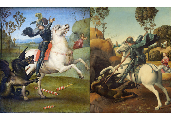
For more than a century and a half, we have known that Greco-Roman sculpture looked nothing as it appears today after being exposed to the elements for millennia. The passerby in ancient Athens or Rome would have not seen the pristinely white marble exempla which you can see in museums. They would have seen polychromic, or colorfully painted, statues.
This is not a topic of debate.
Ever since the Renaissance, artists had produced white marble sculpture, in imitation, oddly enough, of the Greek and Roman examples known to them, which in the course of time had lost their coloring. It was not easy to give up a belief that had been held for generations and one that had, moreover, started a new practice; for previous to the Renaissance colored sculpture had been the rule. However, as soon as the problem was attacked in the modern scientific spirit the result was inevitable. The statements of ancient writers and the actual traces of color on extant Greek and Roman sculptures were too strong evidence to admit of further doubt that throughout antiquity marble as well as limestone statues and reliefs were painted divers shades.
– Polychromy in Greek Sculpture, 1944, Gisela M. A. Richter and Lindsley F. Hall (emphasis added)
Since the late 1990s, a team of curators, art restorers, art historians, archeologists, scientists and more, led by German archaeologist Prof. Dr. Vinzenz Brinkmann and his wife Ulrike Koch-Brinkmann, have collaborated on a collection, Gods in Color: Polychromy in Antiquity ,which has been reconstructed replicas of ancient works colored as they would have originally been seen in antiquity, and has been touring the world since 2003. (The name is a bit misleading because many of the statues were not depicting gods.)
From an academic standpoint, the response has been mostly positive.
Even among nit-picking academics, the Brinkmann replicas are respected. ''For our generation, the Brinkmanns have created a whole series of objects we can relate to,'' said Milette Gaifman, a Yale University professor specializing in ancient art.
– The Colors Of Antiquity? 2022, Zachary Small, New York Times
Gauche? Gaudy? Garish?
Would the theoretical 21st century visitor have enjoyed the sights? Maybe, but probably not. They may have called the usage of color "gaudy" or "garish".
This isn't really a question either.
Acceptance of polychromy by the public is another matter. A friend peering up at early-20th-century polychrome terra cottas of mythological figures at the Philadelphia Museum of Art once remarked to me: “There is no way the Greeks were that gauche.” How did color become gauche? Where does this aesthetic disgust come from? To many, the pristine whiteness of marble statues is the expectation and thus the classical ideal. But the equation of white marble with beauty is not an inherent truth of the universe.
– Why We Need to Start Seeing the Classical World in Color, 2017, Sarah Bond, Hyperallergic
One scholar subsequently analyzed the reactions and feedback, in which many people were disturbed or annoyed by the exhibition. As a random post on social media from this past weekend reminded me, many of the sculptures actually looked better unpainted. And I didn't necessarily disagree.
Even a quote mentioned in 2018 article in the New Yorker used language that would have not been politically correct at the later date.
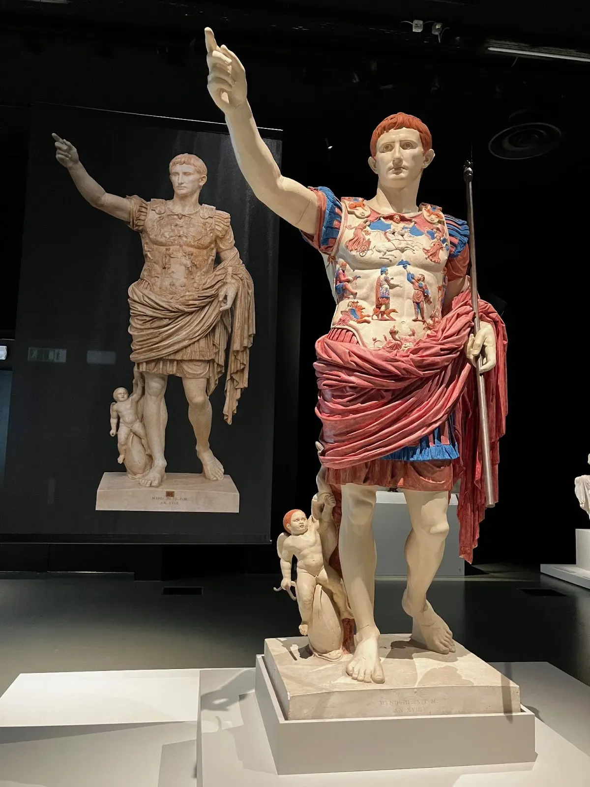
In 2008, Fabio Barry, an art historian who is now at Stanford, complained that a boldly colored re-creation of a statue of the Emperor Augustus at the Vatican Museum looked “like a cross-dresser trying to hail a taxi.”
Barry told me, in an e-mail, that he still found the colors unduly lurid: “The various scholars reconstructing the polychromy of statuary always seemed to resort to the most saturated hue of the color they had detected, and I suspected that they even took a sort of iconoclastic pride in this—that the traditional idea of all-whiteness was so cherished that they were going to really make their point that it was colorful.”
– The Myth of Whiteness in Classical Sculpture, 2018, Margot Talbot, New Yorker (emphasis added)
On paper, that sounds great, but when we actually look at the statue in question, I don't actually know what he was talking about. In fact, before I saw the photo, I had assumed that in 2018 he would have used the term "drag queen" as opposed to "cross-dresser". But neither term is accurate to what my eyes are telling me.
The concept of "double-dyeing" existed in antiquity, and the emperor who would walk around ensconced in a bolt of Royal Purple fabric would have preferred as dark a hue as possible.
If we compare the "original" (ie. the one with the lost color) and the "colorful reproduction", I would contend that the "original" already looked like the "cross-dresser trying to hail a taxi", we just didn't pay attention. The added color seems to have included the blues and purples I've written about before and will write about again. It also shows that what we call Royal Purple is a lot closer to pomegranate than grape.
But perhaps, the art historian Fabio Barry was not thinking of that particular statue when he shared his recollections a decade later.
Perhaps he was thinking of this archer. Did this art historian really believe that the original artist would say, "let's tone the color down a bit, we don't want it looking all of these patterns looking too gaudy"?
We need to remember that we are not necessarily talking the exact shades and hues that the archer in question would have worn in antiquity. We are discussing about how an painter would have depicted that character on a statue.
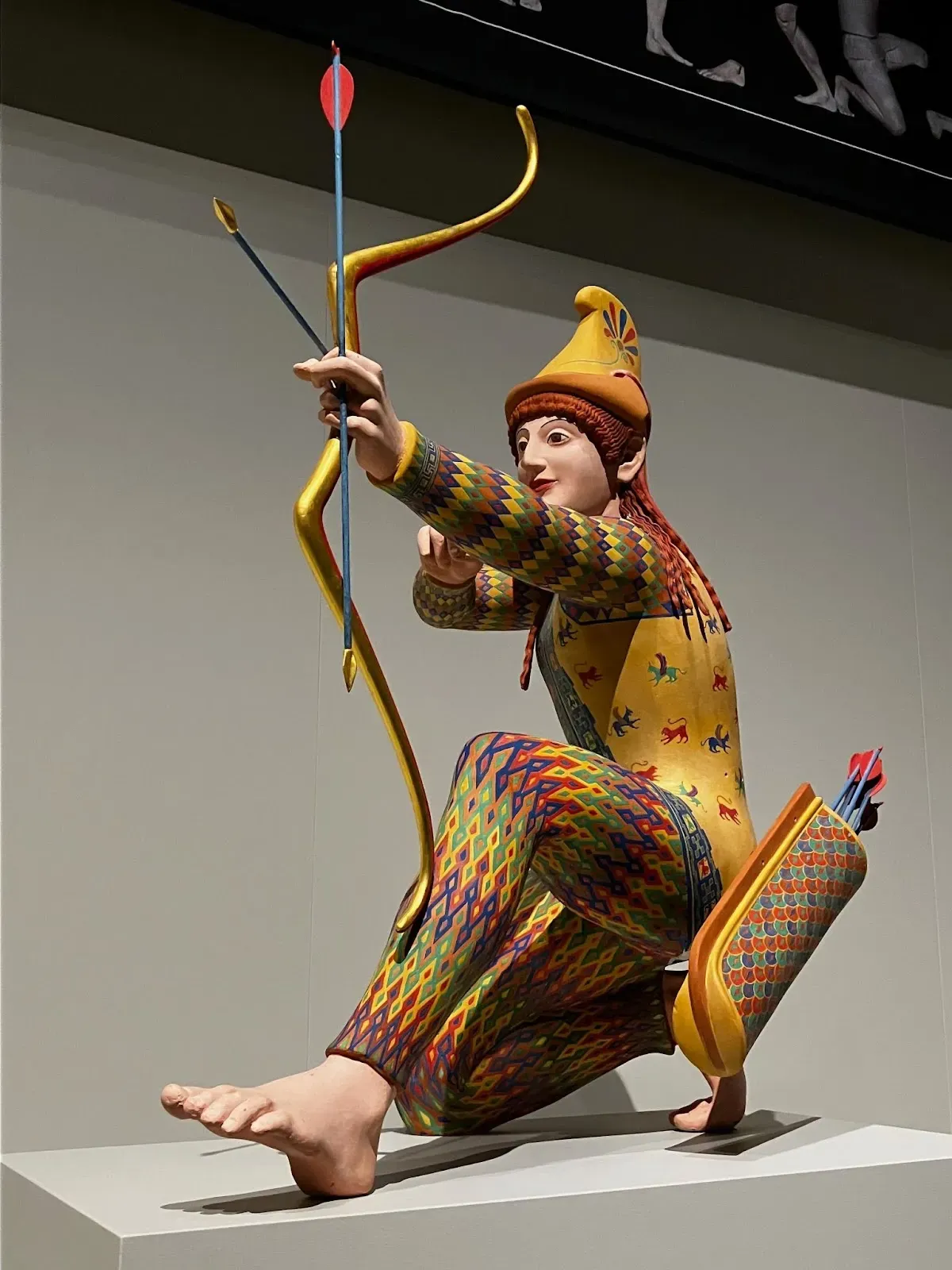
What's even more, is that this particular archer was apparently depicting a character from a neighboring country, which means that maybe making them look overly gaudy was the point.
In 2018, for an exhibition at the Metropolitan Museum of Art titled "Like Life: Sculpture, Color, and the Body", an art critic for a publication called the Washington Post (which apparently no longer employs art critics) wrote:
The goal is to recoup the color that was bleached out of the canonical museum representation of Western art, and bring into the canon a host of artistic and cultural traditions that were more populist, provincial and often riotous than the supposedly serene white forms of perfection celebrated for so long.
– The Met looks at the body, stripped of its old 'whiteness', 2018, Philip Kennicott, Washington Post
Just to point out, the same writer wrote in 2022 an article titled: "What if the ancient Greeks and Romans actually had terrible taste?"
It's also possible that the original figures were meant to be shocking, and our own sense of shock is an analogue to how they were perceived thousands of years ago. We are surprised because they seem foreign, and even perhaps a bit vulgar to our sense of taste. The ancient sense of surprise may have been no less vigorous, though different in kind: They were shockingly not of the real world, more real, or surreal, in a way that elevated them above the ordinary palette of existence. In the case of mythical figures or gods and goddesses, that aesthetic makes perfect sense.
What if the ancient Greeks and Romans actually had terrible taste?, 2022, Philip Kennicott, Washington Post
In general, these sculptures were intended to be displays of wealth and power, and the excessive and varied use of pigment would further promote that intention.
What else can we learn from this?
I feel a bit like the scene in Monty Python's "Life of Brian" (1979) in which they ask "what have the Romans ever done for us?"
They've bled us white, the bastards. They've taken everything we had, and not just from us, from our fathers, and from our fathers' fathers.
A few minutes later:
All right, but apart from the sanitation, the medicine, education, wine, public order, irrigation, roads, a fresh water system, and public health, what have the Romans ever done for us?
– Life of Brian
Outside of the shift in popular perception of the aesthetics of antiquity, the highlighting of the whitewashing of history, the scientific advances which were used to attempt to accurately recreate the original color palettes for these statues, and the insights into the fashion and styles of the ancient world, what else could these recreations possibly teach us?
Red Tulips, Not Whitewashed Lilies
Last year, during my research into the tulips, I quoted the New Testament. I later confirmed that the Aramaic translation of the Peshitta does in fact translate κρινον as shoshanah.
In Luke 12:27, Jesus says “consider the κρινον.” He continues to compare them to the Solomon and uses the word περιεβάλετο (periebaleto, literally to place around) to describe how the fabric falls on the flower, and it has the connotation of being wrapped, not just worn. (This is also echoed in Matthew 6:28-30.)

The verse I was referring to in its entirety:
κατανοήσατε τὰ κρίνα πῶς αὐξάνει· οὐ κοπιᾷ οὐδὲ νήθει· λέγω δὲ ὑμῖν, οὐδὲ Σολομὼν ἐν πάσῃ τῇ δόξῃ αὐτοῦ περιεβάλετο ὡς ἓν τούτων.
“Consider how the [κρίνα] grow. They do not labor or spin. Yet I tell you, not even Solomon in all his splendor was [wrapped] like one of these.
Luke 12:27
Let's assume that I am correct, and we are talking about red tulips here, and not whitewashed lilies. Here, too, the white lily has become associated with purity by preachers and scholars, similar to how Le Corbusier's stark aesthetic of Purism [1] has been associated with the movement to keep the Greek and Roman statues white.
This isn't a random connection. Purism was influenced by Le Corbusier's trip to the Parthenon, replete with its white marble statuary. Around 1911, a
24-year-old Charles-Edouard Jeanneret, the future Le Corbusier, saw the Acropolis in Athens for the first time. This was an essential step in his ‘Voyage d’Orient’, his legendary journey through the Balkans to the Bosporus and the ancient Mediterranean world in search of the fundamentals of architecture. Overwhelmed by the Parthenon, he revisited the site every day for three weeks, sketching and photographing, even comparing the temple to a machine.
Refusing to trap the building in the dry categories of structural Rationalists, he rather saw it as the sculptural embodiment of an idea: a sublime expression transcending all simplified notions of the Classical.
– The Classical Ideals of Le Corbusier, 2011, William Curtis, The Architectural Review
Two years later, we see that this approach is already in the zeitgeist.
Even the aesthete is imbued with the white marble idea. He prates of the "chaste" tone, and protests against any sullying; or he will not have the fair translucent material cloaked with dull patches; and as the final appeal against all Philistinism, he will not have appreciation of pure form distracted by intruding colour. These are the main objections, popular and aesthetic, to painted statuary.
- The Greeks and Painted Sculpture, 1913, D. J. Finn, Studies: An Irish Quarterly Review
August Solomonic Fashion
The question is, how did Jesus anything about Solomon's clothing? I'm assuming that he would have thought that Solomon wore argaman, the biblical purple, but the Biblical text never explicitly says that. And, more importantly, how would the audience all know exactly what he was referring to?

It was more than 900 years after Solomon lived. In other words, we live closer to Robin Hood than Jesus lived to King Solomon. And fashions have changed a lot during that time. It seems to be a very specific mode of dress which is not necessarily written down in any Biblical text.
If we consider again the statue of Augustus Caesar, in which he is wrapped (περιεβάλετο) in a fabric of Royal Purple, and we think about which statues may have been in Roman-occupied Jerusalem around the turn of the first millenium, and how they would have wanted to honor the founder of the Roman Empire.
Everyone would have recognized the visual imagery he was referring to because they had the shared experience of passing by the statue on the street. And in the words of Jesus, the simple tulip far exceeded the beauty of the great emperor.
Censorship
In medieval sermons and midrash, I've seen numerous times when biblical figures are used to represent contemporary individuals. Often it was protective, to avoid the censor or repercussions. Pharaoh is the archetype of every evil dictator. Esau, in his moniker of Edom, or red, becomes synonymous with Rome. The relationship with Isaac and Esau would become symbolic of the relationship between Israel and Rome, Jews and Christianity.
At face value, Augustus would have been a model for how they supposed Solomon, the wealthiest king in their tradition would have dressed. And both Augustus and Solomon were linked to the symbol of the shoshanah/κρινον. As Jesus preaches, ostensibly about King Solomon, he is, in fact, undermining the Emperor Augustus Caesar, and by extension, the Roman Empire.
While saying "a tulip looks more fabulous than Augustus without even trying" is much more politic than saying that Augustus looked "like a cross-dresser trying to hail a taxi", perhaps we can also extrapolate that even in the first century in Roman-occupied Jerusalem, they also thought the colorful statues looked quite gaudy.
Or at least, perhaps that's what Jesus would have said.
Enjoyed this newsletter?
Please consider making a small one-time tip to help support my research.
[1] I am sure that some people would like for me to reference a little more about Le Corbusier's political beliefs, which may have influence his aesthetics as well. I'm not saying that there is a correlation between facism and maintaining the lily white purity of marble.
France's best-known 20th century architect, Le Corbusier, was a "militant fascist" who was far more anti-Semitic and a fan of Hitler than previously thought, two new books reveal.
The unsettling disclosures about the links of one of the world's most famous modern architects to France's wartime collaborationist Vichy regime have been released just ahead of a major Paris exhibition of his work.
It has long been known that Le Corbusier, famed for his revolutionary concrete creations, including a housing project in Marseille called La Cité Radieuse, had some ties to France's collaborationist regime under Field Marshal Philippe Pétain.
Xavier de Jarcy, a journalist who wrote about the find in his book "Le Corbusier, un fascisme francais" (Le Corbusier, a French fascism), told AFP: "I discovered he was simply an outright fascist."
The architect "was active during 20 years in groups with a very clear ideology" but that "has been kept hidden", confirmed another author, Francois Chaslin, who published Un Corbusier.
The new books show Le Corbusier embraced fascism in Paris in the 1920s, and was close to Pierre Winter, a doctor who headed France's Revolutionary Fascist Party.
Together they created Plans, an urban planning journal, followed by another called Prelude.
Mr Jarcy said that in "Plans" Le Corbusier wrote in support of Nazi anti-Semitism and in "Prelude" co-wrote "hateful editorials".
In August 1940, the architect wrote to his mother that "money, Jews (partly responsible), Freemasonry, all will feel just law". In October that year, he added: "Hitler can crown his life with a great work: the planned layout of Europe."
– Le Corbusier was 'militant fascist', two new books on French architect claim, 2015, Henry Samuel, The Telegraph