The Myth and Reality of Trending Colors
Distinguishing between hype and functionality.


Some personal news:
For the next three months, I will be a Senior Research Fellow at DCI (the Data Catalyst Institute), a division of the RXN Group. I'll be focusing on the intersection of technology and culture. I will continue writing the weekly Colorphilia newsletter; I'm just really excited about this incredible opportunity.
Today's newsletter is about "How does a color start trending?" The simplest description of "trending" is "it's referred to the "color of the year" or "color of the season".
The basic three answers are very simple:
Either 1) a company or authority unilaterally declares "this color is now trending", or 2) an international interdisciplinary cabal of industry insiders convenes a conclave and decides that "this color will be trending in about 24 months" and makes the announcement with a cloud of colored smoke, 3) your child watches a television show about a huge singing purple dinosaur and you join the nearly half million people who proceed to purchase a purple car.
(These are all, more or less, factual.)
The correct question to ask is not "how does a color start trending?", but "what do we use color for?" The answer will inform the particular process and function of a color's "trendiness".
The Problem with Popularity
In my initial drafts, I began by referring to phenomenon as "popularity", but it's not exactly popularity. Popular, according to its original etymology, refers to something of the people. I wouldn't necessarily say that something is popular by the sole virtue that it is described as "color of the year". It's an attempt to induce popularity. It's also not necessarily "ubiquity".
If I were looking at this as a historian, I would usually look at photography, magazines, and advertisements from a particular era in an attempt to assess popularity, but it is a very slippery slope to try to look at any set of photographs when you are starting from the point of view that someone declared something to be the "color of the year". It's a very spurious unquantifiable claim.
Unless, again, we are talking about the color "purple" in 1995 or "pink" in 2023.
What do we use color for?
There are two very distinct modern use cases for colors, for which one may wish to know which colors are "trendy".
The first is interior design, which provides numerous possibilities for color options and myriad opportunities to choose complementing and contrasting colors. Not everyone constantly changes their home design or makes continual large purchases for furniture, because everyone has a finite amount of space, and we tend to purchase things with the intent to use them for at least 5 years, or when we move.
It is no coincidence that after livestock, interior design was the first place I found the usage of the phrase "favorite color".
The second is fashion and beauty. Beauty products are depleted with every use, and people have their own timelines for purchasing new clothing, but one needs different clothing for different seasons and activities. With the introduction of fast fashion, the average lifetime for an item of clothing in a wardrobe may be only 2-3 years.
In sheer quantity of items, the number of fashion and beauty-related products in a home vastly outnumber any interior design-related items.
Fashion and beauty tend to be public-facing, while interior design is kept more private. On the other hand, fashion and beauty products are reflections of personal identity, while interior design (unless you live alone) is the result of a shared identity.
The Relative Speed of Trending Colors
Fashion styles evolve a lot faster than interior design styles. Interior design products are produced in smaller quantities and sell for higher price points than their clothing equivalents. In very rough purely observational estimates, someone who buys a $40 shirt may purchase a $400 couch, while someone who buys a $200 shirt may purchase a $5000 couch.
It may take someone weeks or months to decide to buy the couch, while the shirt may be accidentally purchased at 3AM without too many adverse consequences. Interior design is often viewed as an investment, where as fashion, in general, isn't.
It is no surprise then, that there are separate concepts of popular or trending colors for fashion and interior design.
As they mimic the sales and purchasing cycles, the trending interior design colors are tend to be set annually, while trending fashion colors change from season to season.
What becomes fascinating, though, is how the color trends are set or informed. And they could not be any more different.
Interior Design
One of the base color decisions to be made is in the color of the paint for each of the rooms. Any visits to purveyors of paint reveals hundreds, if not thousands, of options, each able to be mixed and altered to match your exact desired hue and function.
The consumer (or the interior designer) tends to make decisions about more base materials. It is simple to choose a different wall paper, paint color, or even fabric to reupholster a couch. One could separate the form of the furniture, with the pop of color it adds to the space.
Unless someone already has the intent to redesign their space, watches a lot of HGTV, or is a vivacious reader of Architectural Digest (AD), they are not likely to be cognizant of the current "trendy" color trends.
Color of the Year (COTY)
Every December for the past 25 years, a company called Pantone, through their Pantone Color Institute, announces the color of upcoming year.
It is not only covered by countless news outlets and blogs, they develop strategic partnerships with companies to release products featuring that particular shade during the year. It creates an aura of prescience from the wide swath of companies who are suddenly releasing something in that color.
It's a marketing strategy. It forces people to consider the COTY and decide if they want to initiate a redesign. They reimagine their lives in rooms painted the color of the COTY, with accent pillows and dishes in the various complementary colors..
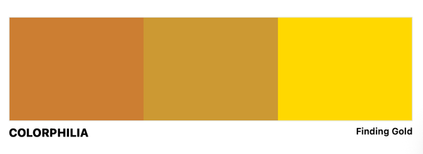
For example, the color of 2024 is “Peach Fuzz”, and Pantone has created collaborations with Motorola, Cariuma (a shoe company), Ultrafabrics, Ruggable, Spoonflower (which holds a design competition every January for the best use of the Pantone color of the year for wall paper and fabric), Polaroid, dsm-firmenich, a vitamin company, Dr. Best, a toothbrush company, a lipstick by Shades By Shan, and even a specially formulated tea blend by a “Tealeaves”, in addition to all regular print on demand coffee mugs that design aficionados love.
I must admit that I've never heard of half these companies before.
But Ultrafabrics, Ruggable, and Spoonflower, are three of the online destinations one would want to visit for a DIY interior design. The COTY is one of numerous colors available, and serves as an option that garners publicity and doesn't really cost too much to execute. It's just one out of many options.
About "Peach Fuzz"
The color itself is described as “PANTONE 13-1023 Peach Fuzz captures our desire to nurture ourselves and others. It's a velvety gentle peach tone whose all-embracing spirit enriches mind, body, and soul.”
It was selected as the COTY for the following reason:
“In seeking a hue that echoes our innate yearning for closeness and connection, we chose a color radiant with warmth and modern elegance. A shade that resonates with compassion, offers a tactile embrace, and effortlessly bridges the youthful with the timeless.”
"Youthful" is a great description. “Peach Fuzz” sounds like a nickname you’d give a Bar Mitzvah kid. The color “Peach Fuzz” looks and feels like that kid.
The COTY Bandwagon
Martha Stewart lists 11 paint companies with a unique colors of the year and declared “Blue” the official color of 2024, which actually is the most on point, as a consensus emerged with 7 out of 11 paint companies naming a COTY featuring some shade of blue, mostly sedate, as opposed to a brighter red being the overwhelming color of 2023. Also, everyone loves blue, so it's always a safe bet.
Kitchenaid decided that their COTY is “Blue Salt”, which is described as “Periwinkle Blue with a subtle iridescent, reddish-pearl finish.” Its exciting genesis is “inspired by the way a pinch of salt can open your senses to new depths of flavor, Blue Salt is anything but monotonous. Salty, yet sweet and blue, yet purple, it’s a living color that sparks optimism, creativity and fresh perspectives.” Now I want one.
On their website, Kitchenaid provides you with a helpful palette of colors in three separate motifs described as “Shine”, “Inspire”, and “Motivate” to repaint your kitchen and purchase new crockery, gadgets, and utensils to complement your new Kitchenaid mixer (only available in the color “Blue Salt” online).
Two Blue Quasi-Haiku
Note: I need to ask my librarian, Oleg Kagan, if these count as haiku. He has previously explained to me that after the Beatniks, English language haiku don't need 17 syllables.
“The color found when we slow down, take a breath, and allow the mind to clear.” Sherwin-William’s COTY is "UPWARD SW 6239", which they call a breezy blissful blue, but reads more gray.
“Violet and blue come together in this elevated, sumptuous hue.” Benjamin Moore’s COTY is “Blue Nova 825”.
A Very Cynical, but Accurate Viewpoint
This is all simply an annual marketing campaign that has a baked-in audience, and allows companies an opportunity to launch a new color, whatever it may be.
The extra benefit of calling it the “color of the year”, is that helps drive more publicity and SEO traffic, and is able to create a perception of cyclical nature in an otherwise “evergreen” industry. By now, media sources expect companies to name a color of the year. Your company gets listed among a dozen others as an industry leader.
Why else would anyone care about a new Sherwin-Williams color when they already have thousands of colors? If you can't choose from the thousands, adding an extra option won't necessarily make things any easier.
The Problems with Pantones 2023 COTY
And as an aside, Pantone’s 2023 COTY was “Viva Magenta” which was introduced as following:
"As virtual worlds become a more prominent part of our daily lives, we look to draw inspiration from nature and what is real," said Leatrice Eiseman, executive director of the Pantone Color Institute.
In this age of technology, we look to draw inspiration from nature and what is real. PANTONE 18-1750 Viva Magenta descends from the red family, and is inspired by the red of cochineal, one of the most precious dyes belonging to the natural dye family as well as one of the strongest and brightest the world has known.
Rooted in the primordial, PANTONE 18-1750 Viva Magenta reconnects us to original matter. Invoking the forces of nature, PANTONE 18-1750 Viva Magenta galvanizes our spirit, helping us to build our inner strength.
Reds are power colors that celebrate life. As a bright, crimson red, Viva Magenta balances boldness with a feeling of fun. This dynamic mix exudes rebellion, but not at the expense of softness. It embodies an expression of fierce grace, inspiring us to show up with confidence and humanity. The digital space has accelerated globalization, and as a result, we are more deeply connected to each other than ever before.
I need to admit: I actually liked the color “Viva Magenta” a lot more than I like the color “Peach Fuzz”. The name is powerful and the color is equally strong.
A Very Pedantic Series of Observations
There is a problem, though: the name, color, and description don’t exactly match. And the problem when you associate a narrative alongside a color, even a great color, the false narrative can cast a pall on the otherwise vivid color.
Magenta was named after the 1859 Battle of Magenta of the Second Italian War of Independence, so "exuding rebellion" is a good thing.
A French chemist had synthesized the dye in the same year, originally calling it “fuchsine”, as its hue is similar to that of the fuchsia flower, which was named by a French botanist after a 16th century German botanist, Leonhart Fuchs. To celebrate the French and Italian victory against the Austrians, he changed new hue to "magenta" .
Why this is relevant is, because readers of Colorphilia know that the color crimson (cramoisi in French) was named after the kermes insect (as well as vermillion, because the whole name of one of the insects was Kermes vermilio). Scarlet was indirectly from the kermes, but it’s a whole linguistic story within itself.
The carmine dye was from the cochineal insect, named because of its carminic acid. The kermes and the cochineal are two different insects, each found in the their own parts of the world, and each have their own respective fascinating backstories.
In other words, “magenta”, “crimson”, and “cochineal” are referring to three different shades of red, from three distinct sources. And this isn't a "cerulean", "ultramarine", and "azul" situation, where all three theoretically refer to the same thing (the color of the sky), but have evolved to refer to different hues.
And magenta was originally synthesized, it is not from nature.
So why are they naming a natural color based on an insect after a synthesized color which resembles a flower?
Pantone's Purpose
While this may all seem quite pedantic, Pantone has more than 15,000 different colors. They each have a unique identifying number, and the name is wholly superfluous, but it just feels weird to choose a name that refers explicitly to a different shade.
But here is the thing: Pantone’s strength is not in their color-naming, their trend-spotting or their trend-setting, it's their Pantone Color Matching Systems, or the ability to communicate a common color, and understand how it will appear on different materials and media.
Pantone makes money, inter alia, by selling swatch books for thousands of dollars a pop. Well, swatch books, swatch postcards, and COTY coffee mugs. Swatch books provide a common language.
They exist so that your designer can direct your printer, or your web developer, or your contractor precisely which shade to use.
Pantone needs to know, in general, what the latest colors that people wish to communicate are, so in that way, they do need to know trends, but not in a prescriptive way. Rather, in a descriptive way.
In more biblical terms, if Pantone had existed during the building of the Tower of Babel, at least the walls would have been painted the correct colors.
Pantone provides an important service, and I would love to explore the various taxonomic systems for color at some point. But this newsletter was about their prescriptive color of the year choices, not their overall utility.
The Pantone COTY is a consumer-centric campaign, which gives them brand recognition, publicity, and constant association with color, but I wouldn’t say that their chosen shade names or their explanations are exceptionally good.
Fashion
Swatches and Fabric
Pantone did not invent the swatch book. Swatch books are a practice that goes back to the 19th century, originating with the individual fabric manufacturers, and then, an enterprising individual simply went out, bought all the various fabrics, and cut them into squares, and sold the books. And from there, they evolved into what they are today.
Evolution of an Industry
The forecasting industry began with cables from Paris announcing the colors seen in runway shows, with the understanding that the styles would trickle down to the US, evolved into makeshift human-powered intelligence outfits who counted among their clients companies from every part of the ecosystem, at least ensuring that decisions made by the dye and fabric companies would find their way to be used by the fashion houses and designers, and that the buyers would buy them for the stores, stylists would use them, movies would feature them, magazines would cover them, and hopefully people would purchase them.
These forecasters began using psychology and sociology, created focus groups, and always kept their eyes on potential trends from tastemakers wherever in the world they would be. And every single one of the industry companies would pay dearly for those invaluable insights.
It some cases, it has evolved into a data-science with predictive modeling based on forms of adaptive algorithms, rivaling the algorithms used by high-speed trading companies. The argument could be made that the fashion industries’ forecasting algorithms need to be more robust and based on fuzzier data points, like what is the latest trend in Harajuku in Japan which may find its ways to the US.
The First Fashion Forecaster
Modern US fashion forecasting began with a weekly newsletter called "Fashion Reports from Tobé" by Tobé Coller Davis in 1927. Each was 50-100 pages long, and during the interwar period, their cost ranged from $500-$3000/year depending on company size and sales, with more than 100 corporate clients. Her personal take-home between $50k-100k in the 1930s.
She didn’t only predict, she interpreted and translated fashion styles between cultures, and she made suggestions on what to to do. By the mid-50’s she had thousands of subscribers for a weekly digest.
The Value of Being on the Same Page
Fashion is a trillion dollar industry which requires the careful collaboration of a very diverse ecosystem to be able to anticipate the tastes and desires of other members of the industry.
Fabric dyeing is a lengthy, precise and expensive process. A fabric company needs to be able to plan years in advance to know which hues they need on hand. One can't order 1000 bolts of a custom dyed fabric and expect them to be ready immediately. It's not print on demand, like Pantone's partner, Spoonflower.
The company needs to be able to forecast what colors will be most in demand. The forecaster ensures that demand.
It means that the fashion houses and designers would choose to use that color, the buyers would want to purchase them for the stores, stylists would want to dress their celebrities clients in those colors, and that the fashion media or the internet wouldn’t crucify them about the color choice, and then would want to purchase clothing in the same color.
Mistakes and missteps can cost billions of dollars.
Even in the 1920s:
…its purpose was to “limit as far as possible the haphazard buying of colours, by telling buyers in advance what the chief colours of the coming season will be.” If widely adopted, the forecast promised to relieve the “textile trade of one of the constant and expensive burdens of attempting to guess what will be fashionable from a bewildering variety of shades. The colour forecast, therefore, may be looked upon as a trade instrument which will help all concerned to place orders for coloured goods with certainty, and therefore with economy.”
From “The Fashion Forecasters”
The quoted journalist called color forecasting “propaganda”, because at the end of the day it was marketing and driven by the fabric industry and their interests.
Fabric swatch books are functional marketing in the purest form.
Bloomberg for Fashion
One example of a modern fashion forecaster is WGSN, which was purchased by a private equity group in 2024 for £700m, with some of the most impressive brands in the world on their client roster.
Access means that everyone is paying dearly for the same playbooks. Everyone has the same facts, if they can afford them. Which means that a report from a single company like WGSN is able to push the needle and set a trend 24 months in advance.
When to Start Planning
WGSN has a partner and sister company who functions as their color authority, Coloro, a Pantone competitor seemingly more focused on fashion and product design. Unlike Pantone brand name recognition, I had never heard of Coloro before researching this piece.
The differences between them are stark: Pantone advertises more than 15,000 colors for everything and every use you can imagine, Coloro admits to a more conservative 3500 colors, but they are the colors that you would want.
Even the timing of their announcements are telling: Pantone made their 2024 COTY announcement in December 2023. WGSN/Coloro made their 2025 COTY (Future Dusk) announcement in May 2023. (Both include an array of complementary "key colors".)
One would assume the announcement was only made after discussions with their customers across the ecosystem. The color becomes one factor in a thousand which are translated into their collections.
Color is a limitation which increases creativity, as opposed to constricting it. Every designer has their own unique version of a little black dress (LBD). Similarly, the prescriptive insights from forecaster allow the designer to apply their own interpretation.
#Trending
Color trend forecasting becomes a self-fulfilling feedback loop for industry to all be on the same page, whereas announcing a color of the year is a marketing ploy to attract new customers.
Both are similar top-down prescriptive declarations, focused on different audiences.
On an existential level, both color trends are manufactured and somewhat arbitrarily chosen, but in reality, one is a thinly-veiled marketing campaign which the media loves sharing as a fun human interest story, and the other one is the basis for an entire industry to invest billions of dollars in what will likely be "trendy" in two years. And if every company follows the prescribed advice, the forecast becomes reality.