The Relative Irrelevance of Historical Colors
Please don't buy paint colors for your home simply because they were popular during the 18th and 19th centuries.

My apologies for the relative lateness and brevity of this newsletter, and for the lack of a new original illustration.
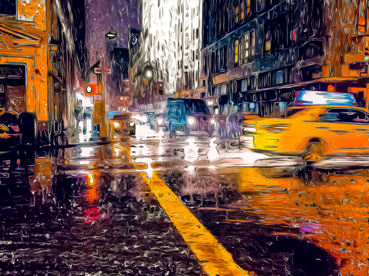
A few days ago, I read a great New York Times article by the Ashcan School artist John Sloan, in which he determined that the color of New York City (in 1925) was gray. Less than a month earlier, the New York Times had misquoted him saying that New York did not have a color, so I appreciated him setting the record straight.
That said, I could not agree with John Sloan, at least in the current century. I thought back to my life in New York City, and to the colors of East River promenade, Madison Square Park, and the bright colors of Curry Hill.
But if I would have to choose a single color emblematic of New York City, it is taxicab yellow, and I don't feel like I need to qualify that anymore.
As I looked around the midwestern neighborhood where I currently live, trying to ascertain its color, I became overwhelmed with the gray sky, the drab brick exteriors, and gray asphalt. It was only when I looked at the green park across the street from my home did I see symbols of life.
In order to brighten up my day a bit, I wandered into a local store which sells house paints, just so I could look at all the nice colors. I chatted with the color consultant, who told me that most people buy drab colors for their homes, because they didn’t want to bother the neighbors too much. “Maybe they’d choose a colorful door, but nothing too loud.”
And then I saw the sign which broke me.
They had a featured section described as “Historical” colors. The explanation read “A Selection of 191 of the Most Popular Colors Documented from the 18th and 19th-Century Homes Throughout North America.”
This is akin to a doctor’s office proudly advertising their 16th and 17th century medical procedures.
I desperately wanted to see their research, considering that I don’t think that premixed paints even existed in the 18th century, and every house painter would simply mix their own. The first synthetic paint Prussian Blue was only invented in the 18th century, so that tells us about their selections.
And this is not even mentioning Scheele’s Green, the 19th century paint color that killed people who lived in the house. I think that it had something to do with the arsenic in the paint.
I'm not saying that the selection is necessarily ahistorical, rather that there is very little reason why such a selection should be useful for anyone who didn't write a newsletter about the historical use of color.
As I tried to find the words to describe my uncharitable feelings to such a selection of colors, I found solace in a rant that someone named Henry William Arrowsmith wrote in “The House Decorator and Painter’s Guide” in 1811 about misguided people who tried to copy Ancient Roman design and gaudy paint colors choices:
Judging from the ancient specimens of the Arabesque which still remain, the Roman artists appear to have adopted the most vivid style of colouring, and aimed at obtaining strong contrasts. Upon an inspection of their works, the observer is at first amazed, and is at a loss for any probable conjecture to account for the gaudiness of the appearance.
It is easy, however, to give a reason for this peculiar, and to us, unpleasant feature of Roman decoration, when we remember the insufficient distribution of light in all ancient dwellings. The want of glass must have presented great difficulties in the progress of the art of decoration, and have even retarded it, among the Romans; for although they were acquainted with the use of this substance as transparent medium, and adopted some admirable substitutes, the costliness of the one and of the other must have prevented their common use, and indeed, confined their introduction to the dwellings of the wealthy.
A very uncertain and insufficient light was therefore admitted into the apartments of a Roman residence, so that the glare and vulgarity produced by the frequent contrast of positive colours were subdued and softened by the half light in which the composition was viewed. Many of the Roman apartments seem to have admitted no other light than that which could be obtained from lamps or other artificial sources, being constructed without windows or any direct communication with the external atmospheric air, and therefore shut from the passage of a single ray of unreflected solar light...
... From these remarks, it will appear that the strong contrast of colour was probably intended by the Roman decorators to relieve the dulness of their dwellings, and to give a cheerful aspect to the otherwise gloomy and desolate apartments.
Some modern authors, in their remarks upon Roman decorations, have condemned in undue terms of reproach, the want of harmony in colour, forgetting that if the style of painting which they advocate had been introduced in the half-illumined apartments, no effect at all to be compared with that obtained from the style they censure could possibly have been produced.
If the Roman artists were induced to adopt their method of colouring from the considerations we have mentioned, the modern decorator should remember, that as our rooms are neither built nor lighted in the same manner, there is less occasion for a vivid and contrasted colouring.
On the other hand, we would recommend a lighter and more delicate style, as being better suited to the modern method of building. Nor are we without precedent among the works of the ancients for the adoption of this more delicate style of colouring in the decoration of houses, if indeed such authorities are required from the works of the ancients.
Strange as it may appear, there are those who with little knowledge of the state of the arts among the nations of antiquity, and with less of the relics of their skill, pretend to despise all that they, or those whom they follow, choose to consider an invasion of the Greek or Roman styles.
With as much propriety might they insist upon the adoption of the dress, habits, superstition, and mythologies of these great nations; or, defending the character of one, blame the other for want of conformity; or, as well might they reproach nature that all countries have not the sunny clime and cloudless sky of Greece, and all men the daring intrepidity and masculine pride of the Roman.
It happens, however, too frequently, that those who are the most servile slaves and copiers of the classical styles, and introduce all the ancient practices without thought or consideration, are but little acquainted with the genius of the people, and consequently unable to draw a comparison between the state of society in their day and that which regulates modern usages. To such persons we should address ourselves in vain.
In short: Because the Romans didn’t have glass windows, they used brighter colors to bring some sort of light to their homes. If you are lucky enough to have glass windows and external light, you may want to choose different colors.
Similarly, choosing house paints based on a time period where they didn’t have access to most of the paint colors that we have today seems similarly misguided.
My advice: If you are going to use a historical period as a guide, look to the 1950s and 1960s when they were genuinely excited about all the new colors available to them and celebrated them in every aspect of their lives.